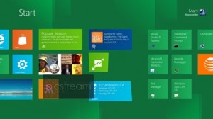
Overview of the new Windows 8 (beta)
Thursday, October 27th, 2011 8:05:33 by Kashif Khan
Overview of the new Windows 8 (beta)
Windows 8 is Microsoft’s combined desktop, laptop and tablet operating system, designed to go from 10-inch touch-only tablets to big screens in your living room, from ultra-portable notebooks to massive gaming systems and business desktops.
Windows 8 also features gestures to put two apps on screen side by side, and the traditional Windows desktop for when you need richer apps like the ones we’ve been using in Windows for years.
That’s a combination no other single operating system can offer – but how well does it work?
The inspiration of Windows Phone 7’s Metro interface is clear in the interface for the Windows 8 Lock screen and Start screen (which completely replaces the Start menu).
But this isn’t a slavish copy of the phone operating system look.
It still has the live tiles and the personalisation, enabling you to pin people, RSS feeds and web pages alongside apps. But it’s more colourful, more flexible and better designed, to enable you to arrange and explore large numbers of apps.
You can customise both the image you see on the Windows 8 Lock screen and the details of unread emails and missed instant messages that it shows. And you can pin desktop apps such as Office or Task Manager, and even a link to the desktop, to the Lock screen.
You can group tiles together – giving groups a name or leaving them blank – and make any tile single or double width. Just swipe the tile up a little to get the option to change the size, unpin the app or uninstall it completely.
You’ll be able to do that for pre-installed Metro software too As well as moving a tile to a new location by dragging it, you can also drag it up to the top of the screen with one finger and hold it there while you swipe across the screen to get to where
you want to drop it – a much easier way of dealing with a long list of tiles.
Future builds of Windows 8 will also enable you to pinch to zoom out so you can see all the tiles on screen at once, and rearrange groups at the same time.
The transition between the Start menu and the desktop is also a little jarring, even though switching from Metro to desktop apps works well.
It may be that Microsoft will refine the experience, or it may be that people will get used to it. At this stage there are certainly rough edges, but the Windows 8 experience is also extremely compelling and genuinely innovative.
Tags: , interface, Mac OSX, microsoft, windows 7, Windows 8, Windows Phone 7Short URL: https://www.newspakistan.pk/?p=1747


