Windows 8: A complete review of the Beta version – Part 2
Monday, March 5th, 2012 5:22:49 by Usman Khalid
The new OS has a host of new features that range from settings to applications to connectivity to the internet and other neighbouring devices to syncing and whatnot.
We will go through them one by one but let’s talk about the Metro interface first.
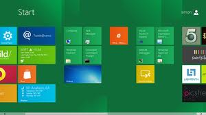
Microsoft has introduced a new Start Menu interface that has made nothing but news since the pre-Beta version first shored up in September. It is not only attractive but is stunningly interactive as well. Apple might be on sleeping tablet since the first release of Win8.
The menu is comprised of tiles that range from mail to RSS feeds to social networking to almost everything. However, they apps are not limited to Metro interface, many applications that can only run on traditional windowed interface can also have their presence on the new Start menu.
The September release had its reservations in altering the size of the tiles and regrouping them according to the likes of the users but the new updated version has eradicated that flaw. These tiles can be resized by tapping and holding the finger on the tile can be moved to a new location or a new group by tapping and dragging the icon, or tile as Microsoft calls it, to new location. The neighbouring tiles will adjust themselves accordingly.
Moreover the users can create their own groups by creating them in the settings and populating it with new application representatives (tiles, of course).
The Metro interface has all the old functionalities of multi-tasking and beyond, but now with hand gestures. Pinch to zoom out to have a universal look at menu and select and rearrange the tiles as desired.
Tags: android, Apple, desktop, google, Internet Explorer, ios, laptop, metro interface, microsoft, tablet, win 8, Windows 8Short URL: https://www.newspakistan.pk/?p=14655


