Nokia Lumia 900: Full Review (2012) – Part 2
Thursday, April 5th, 2012 6:27:52 by Usman Khalid
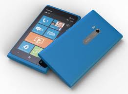
Having said that, Lumia pack a punch in its unibody structure that deliberately comes in some flashy colours like Magenta, for example. Its lightly sculpted chassis and deliberate use of coloUr scream “lifestyle product.” Bold as an exclamation mark, the Lumia 900 has pure pop-art coursing through its electrical veins.
The chassis has a perfectly flat top and bottom, with round sides and a slightly curved back, which Nokia then topped with a large, glossy screen.
At 5 inches tall by 2.7 inches wide by 0.45 inch deep, it’s a large phone. The smooth, matte finish helps it slide into pockets and purses, but because of the width and flat back, the Lumia 900 did feel a little flat in my hand. However, it was comfortable on the ear. It may feel a bit heavy at 5.6 ounces, but it’s also very solid.
Back in its heyday, Nokia phones were largely synonymous with solid construction and thoughtful — and sometimes daring – design. The Lumia 900 may not present a strictly new design, since it’s clearly adapted from the Nokia N9 Meego-based phone released in Asia, and the Lumia 800, the European version of the N9 that runs Windows Phone, but it’s a good one that offers slight variations.
The beautiful 4.3-inch AMOLED screen features ClearBlack display technology and Gorilla Glass. Colors look richly hued, bright, and sharp. I compared the Lumia 900 with the Samsung Focus S, which has an identical screen size and WVGA resolution (800×480 pixels).
Tags: 4g, 800, 900, amoled, android, Apple, at and t, at&t, finland, finnish, google, ios, lte, lumia, microsoft, Nokia, smartphone, US, windows phoneShort URL: https://www.newspakistan.pk/?p=18179


