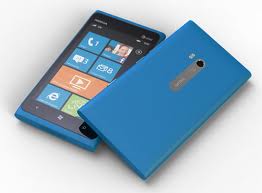
Nokia Lumia 900: Full Review (2012) – Part 3
Thursday, April 5th, 2012 6:27:47 by Usman Khalid
In both brightness and richness, the Lumia 900 absolutely blows away the Focus S, which at the time I hailed as a beautiful Super AMOLED Plus screen in its own right. At the same levels of full and automatic brightness, the Lumia 900 shone about a full level brighter than the Focus S.
Beyond the screen, there’s the front-facing camera and three touch-sensitive navigation controls on the phone’s face. Nokia’s sense of chic minimalism extends to the silvery controls on the right spine. From top to bottom, you encounter the volume rocker, the power button, and the camera shutter button. I’d prefer a different placement for the power button and volume rocker, but I could get used to it. The top of the phone houses the ports: the 3.5mm headset jack, the Micro-USB charging port, and the micro-SIM card slot behind the push-in door. As with the iPhone, you can insert a narrow “key” (or thin, unbent paper clip) into a hole to pop out the small SIM. Nokia kindly tapes a key right in the box, saving you from paper clip mutilation.
The smartphone comes with two cameras, one in the front and one in the back. The front facing camera is an ordinary 1.3-mega pixel snapper that is mainly there for video chatting. However, it also takes reasonable pictures in the bright light.
Tags: 4g, 800, 900, amoled, android, Apple, at and t, at&t, finland, finnish, google, ios, lte, lumia, microsoft, Nokia, smartphone, US, windows phoneShort URL: https://www.newspakistan.pk/?p=18180


