Samsung Galaxy SIII (2012): Full Review – Part 2
Friday, June 22nd, 2012 5:57:18 by Usman Khalid
The turnoff was expected to be its tuned-down dual-core processor from the quad-core brain in the global unlocked version but the processor is as zippier as the quad-core. The menus are responsive and offer no clipping.
The screen, though is pretty sharp for normal standards at 1280×720-resolution, offers less brightness and darker tint on the real estate. However, that is not to say that its colour quality has been effected in any way. Even in the absence of IPS+ panel, found in the iPhone 4S and HTC One X, the screen boasts nearly natural colour palette.
The build quality might not be out of ceramic or micro-arc oxidized aluminium but the plastic used is of premium quality with greater attention given to the texture details.
Design
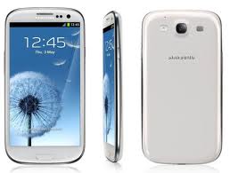
If you are looking for a slab-shaped, iPhone-like smartphone, Galaxy SIII is not the handset for you. If you want smaller screen and you have small hands than SIII will be a throwback for you. However, if you can make an exception to the screen size or are actually looking for more screen real estate and want a rounded-edge design with a little curve at the back, Samsung has provided the perfect smartphone for you.
The new SIII has relatively more rounded edges than most of the competition in the market, much less than One X and 4S. However, that is not to say that it is prone to slip from your hands like Huawei Ascend P1. The SIII has a premium texture design both in the back and front bezel. Extreme attention has been given to the contour details on both front and the back of the handset.
The front side features no-nonsense elements; 4.8-inch screen, one physical home button, a menu and back button sandwich the home key, a front facing camera. The back and menu button disappear in the blue body after sometime of the use; they both are capacitive keys.
Tags: 3, android, galaxy, Ice Cream Sandwich, ics, iii, s, SamsungShort URL: https://www.newspakistan.pk/?p=26680


