Google/Asus Nexus 7 (2012): Full Review – Part 2
Tuesday, July 3rd, 2012 4:18:36 by Usman Khalid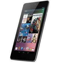
Design
The new Nexus 7 does not incorporate a unique design. It is yet another black tablet in the market already waterlogged with black devices. However, its simple slab-like design and silver trimming alludes the public that it is slimmer than most of the tablet devices in the market.
At first look, the tablet looks substantially slimmer than the Kindle Fire, however, it actually is only 0.04 inches thinner than the Amazon product. However, its tapered design at the edges is quite different from other 7-inch slates and makes it look sleeker than the rest of the bunch.
The back is black but Google has done a marvellous job of keeping the design aesthetics a little different from its competition. The back is rubbery, textured plastic that offers more grip and a different design from the likes of Galaxy Tab 2 and Kindle Fire.
While the topic of holding the device is in session, the device is much easier to hold than a Kindle Fire for its light-, feather-weight clocked at 0.74 pounds. The light weight helps in holding the tablet for longer periods of time as in reading a book and watching a movie.
The front of tablet houses a 7-inch capacitive-touch sensitive screen and 1.2-mega pixel camera. The right spine has all the buttons that come with the tablet; a power/sleep button coupled with a volume rocker. The bottom edge has a micro-USB port and a 3.5mm headphone jack.
In portrait mode, the Nexus 7 measures 7.8 inches in height, 4.72 inches in width and 0.4 inches in depth. It weighs 0.74 pounds and screen bezel is 0.8 inches on average from either side. The bezel has been kept thicker unnecessarily, however, that is something of a compromise that does not bother much.
Tags: 7, android, google, jelly bean, nexus, operating system, os, tabletShort URL: https://www.newspakistan.pk/?p=28009


